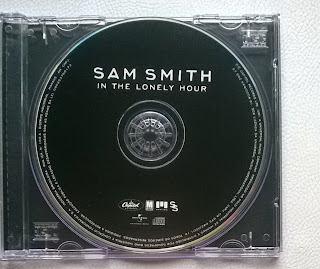
On my CD, I featured the title of the album and also the artists name. I did this because I wanted to keep a consistent theme throughout my digipak because I have the album/artist name on the front and also the back. To get the text onto the CD, I used the 'Horizontal Type Tool' using the font I downloaded from dafont.com 'Neoteric'.
I then used the 'Line Tool' so that I could put the line between the album title 'LXWXS' and the artists name 'Lewis Ryan'. I did this because, again, it shows continuity throughout my digipak because I also used this tool on my back cover in the same way.
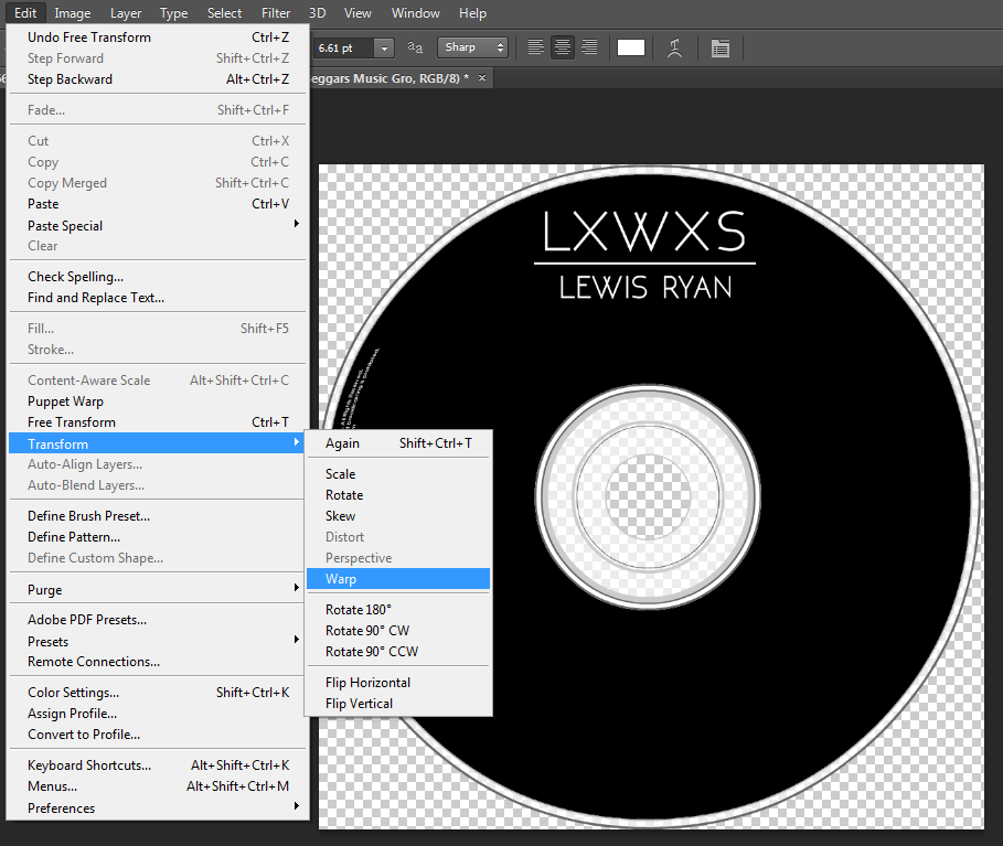

I then used the 'Horizontal Type Tool' again so that I could type up the copyright information to go around the outer ring of the CD. I did this and then because I needed it to fit in the shape of the CD (like a semi-circle), I went on 'edit' then 'transform' then the 'warp' tool so that I could warp it into the semi-circle shape I wanted. Above is the outcome of using this tool. I think it worked really well and looks how it would on any existing product.
 Then, to get all the appropriate logos like the record label, I had to google their specific logo and then copy the file into Photoshop. After doing this, I then scaled the logo down to the size that I wanted and put it in the spot that I wanted it. I then repeated this process with the other logo 'Beggars Music'. One thing I did differently with the 'Beggars Music' logo was change the colour to white because the initial logo is black and this wouldn't appear on my CD due to it being black. To change the logo to white, I used the 'Quick Selection' tool which allowed me to select the specific parts of the logo I wanted to change. After selecting the specific parts, I used the 'Paint Bucket' tool which allowed me to fill the text in white.


No comments:
Post a Comment