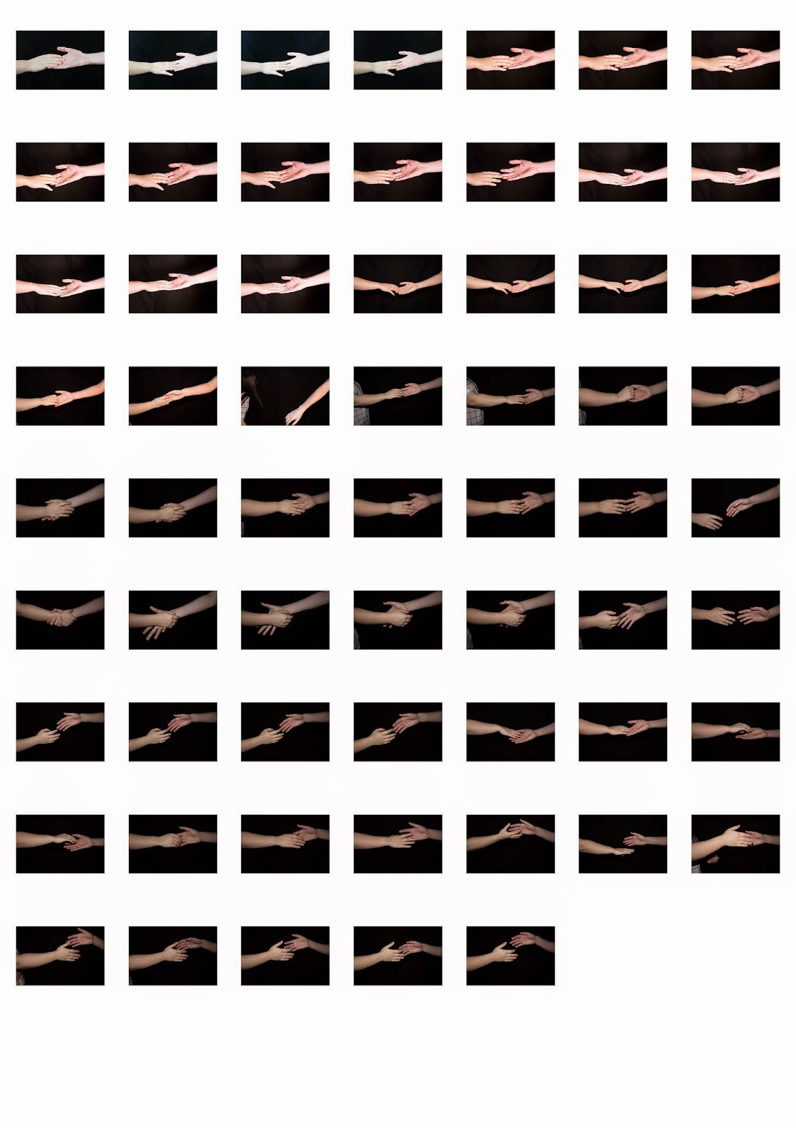
Below are the original images from this shoot:

This first image shows I have used the black and white adjustment layer tool and I have altered the different coloured tones throughout, brightening and darkening certain tones and shades within the image. I mostly altered the blues and yellow as these were the main colours in the original. Altering the yellow brightened his face and I liked this as it put focus on his face, which is exactly what I was wanting.
I then wasn't too convinced at the sizing of the image as I didn't think it looked exactly square so I went onto the template and got the measurements of the width and height so I could manually constrain it. I went into 'File' then 'New' and I created a new file which was at the correct requirements to fit the image onto the template. When I dragged the existing image onto the file, I was really close in scaling so only a bit had to be cropped off.
This is the part where it shows how I have cropped it to fit exactly right on the template. After cropping it to its exact size, I merged the layers and then dragged the photos onto the template. I used free transform to scale it to the template and it fit perfectly in the box it needed to be in which proves I used the correct measurements.
I then did this 3 more times with the other 3 images as I felt this way worked best for me and I felt more confident in how to do it. I know there was probably a quicker way to do it and I would have saved time, but in the end it looked how I wanted to anyway and doing it in my own way felt better so I didn't have to rush. I feel like the way I did it was beneficial as when I went to put all the photos on the template, they all turned out at the right sizes so this method is good to follow as it proves successful.


No comments:
Post a Comment